Prepare Your Excel File
Download the sales by branch sample file
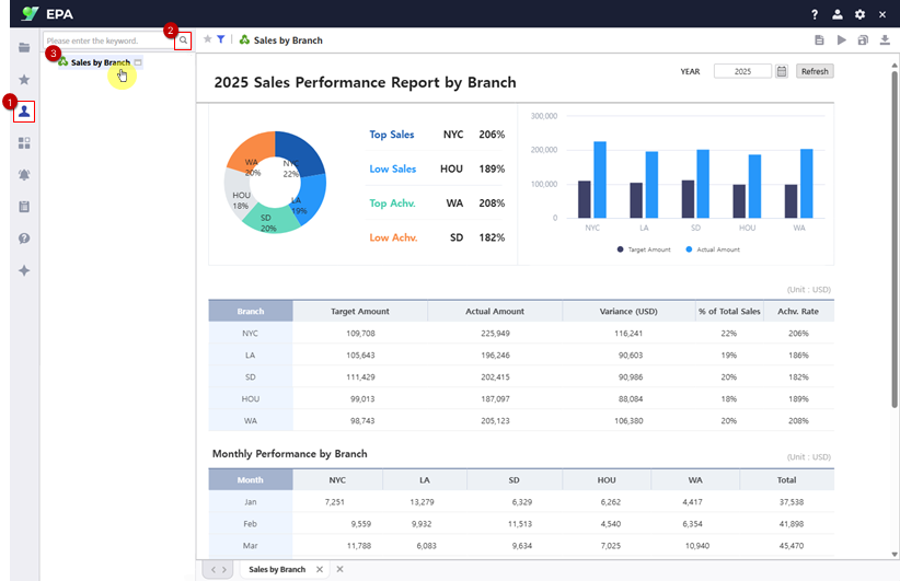
Download the sales by branch sample file from Learning Experience Samples. This file contains branch-level sales data including target amounts, actual amounts, and achievement rates.

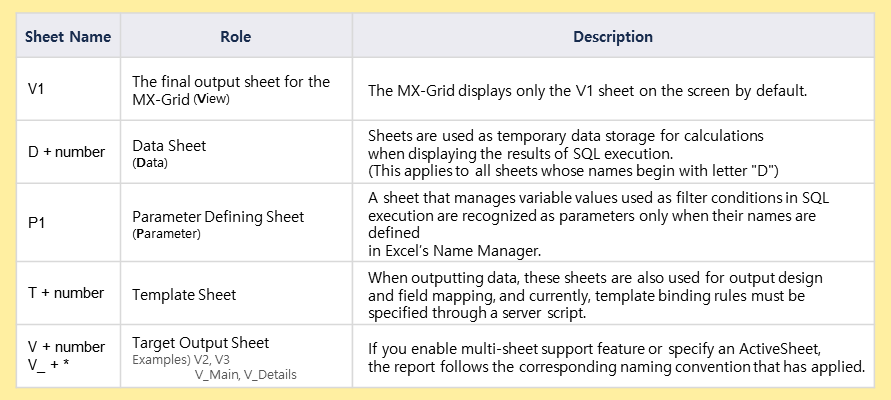
Excel Sheet Naming
Understand the V/D/P sheet naming conventions
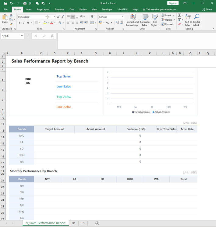
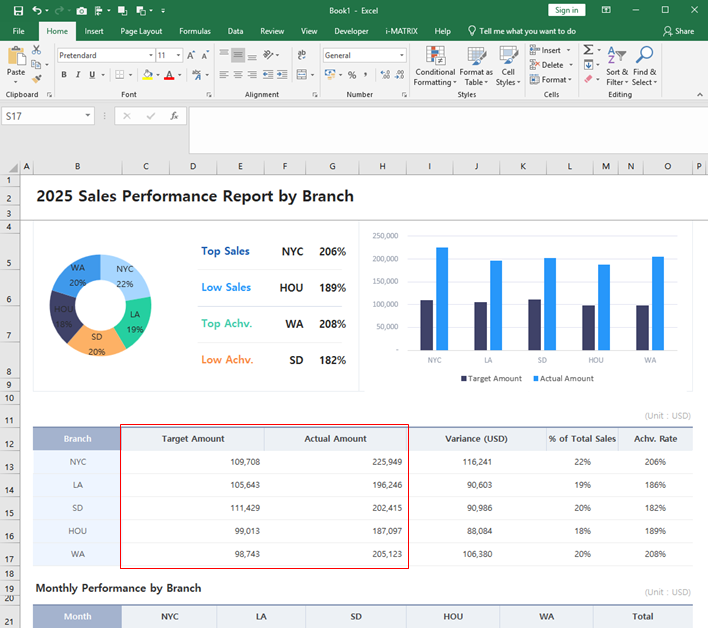
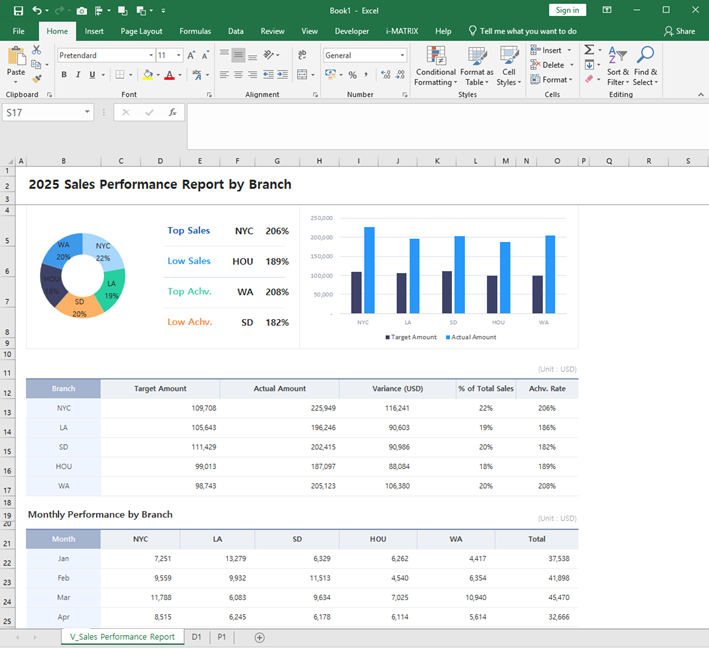
The V Sheet is the display sheet showing branch sales performance.
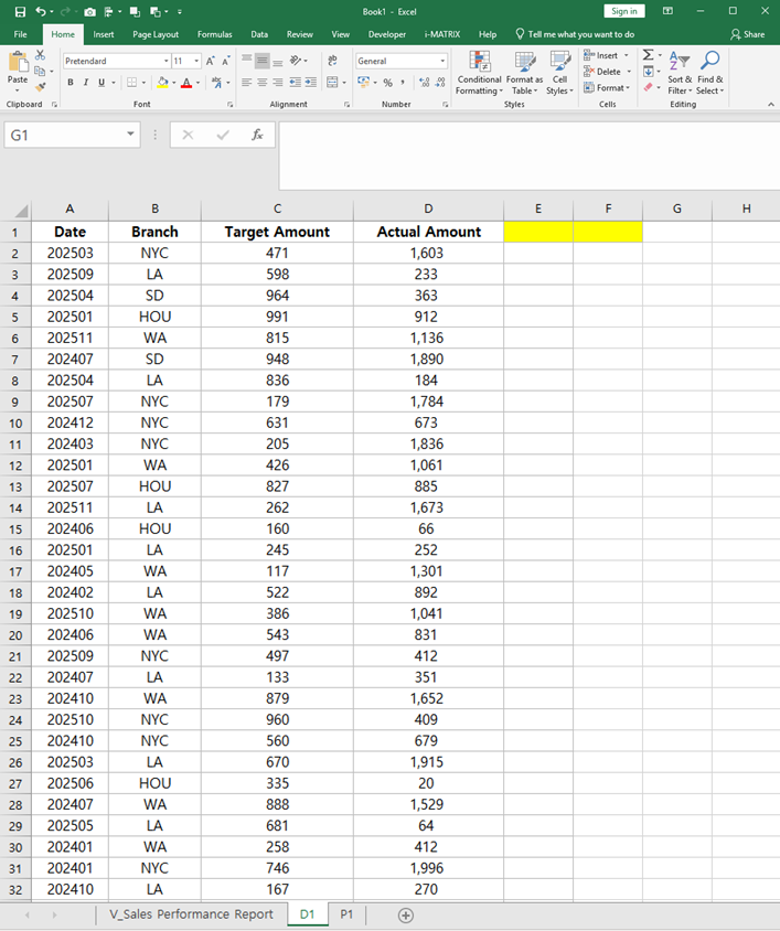
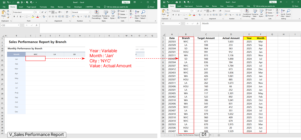
The D Sheet contains the raw data with all branch transaction data.
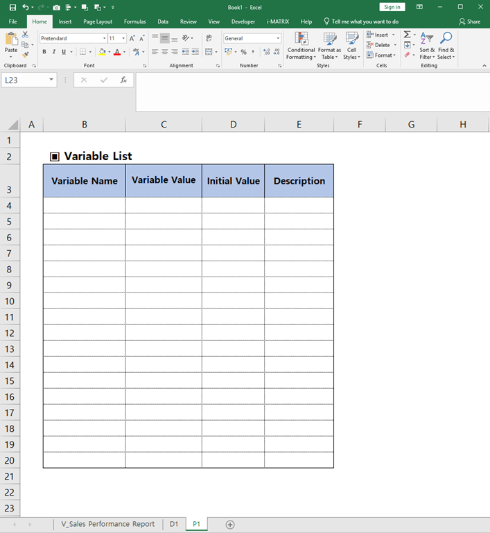
The P Sheet defines the parameters and filter variables.
Review the complete sheet structure overview to understand how the V/D/P sheets connect.
Tip: V = View (display), D = Data (source), P = Parameters (variables). This naming convention is standard across i-AUD reports.
Set Variables & Connect Data
Configure Name Manager and SUMIFS formulas
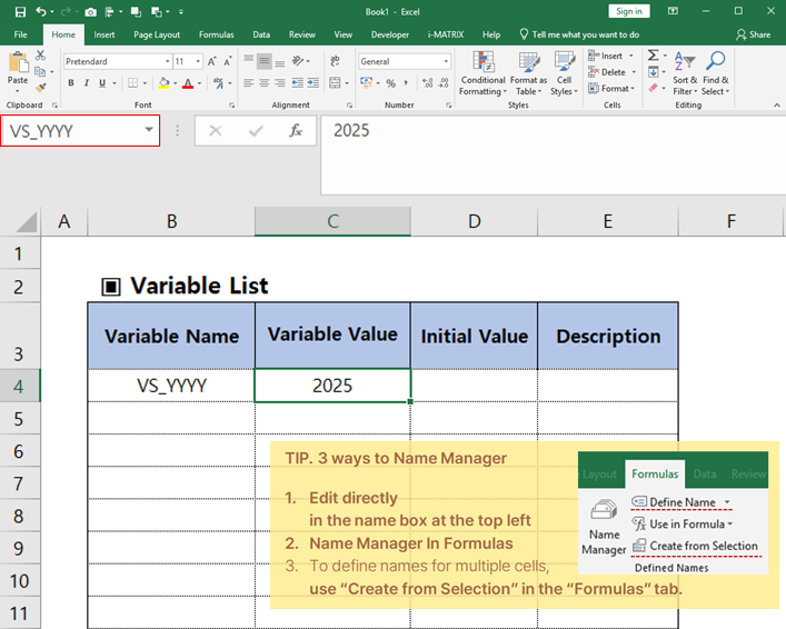
Use Excel's Name Manager to define variables for the year filter.
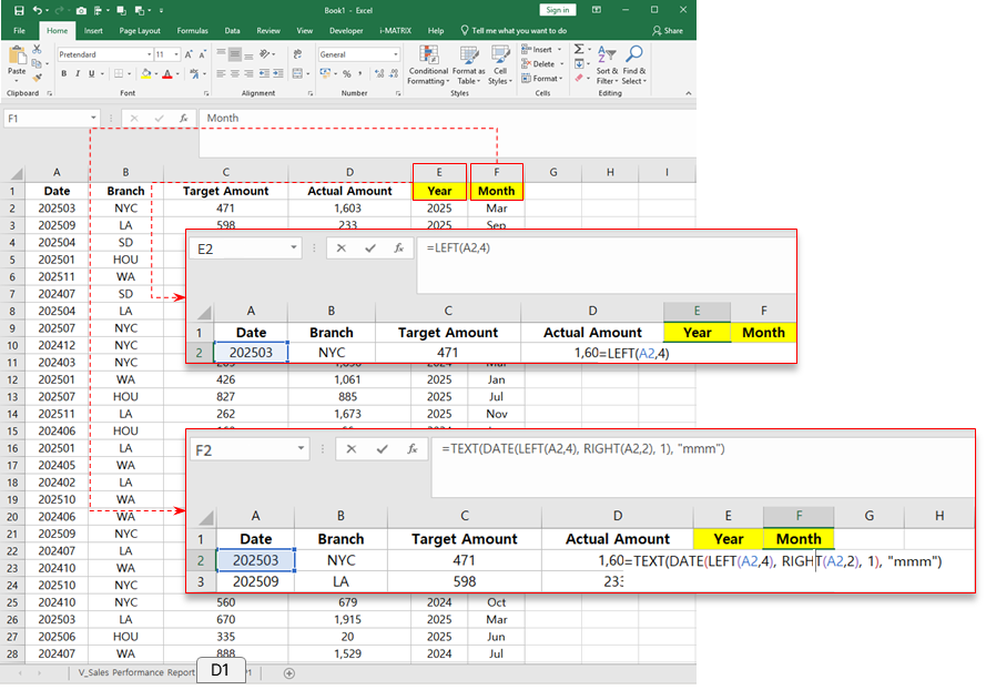
Create a derived column to separate the date into year and month components for filtering.
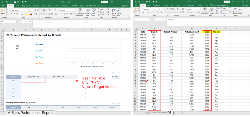
Set up SUMIFS formulas to aggregate sales data by branch, connecting the data sheet to the display sheet.
The charts and achievement rates are auto-calculated based on the SUMIFS formulas you configured.
Set up SUMIFS formulas for monthly performance tracking to aggregate branch sales data by month.
Verify the data connection is working correctly between the sheets.
Convert to Web
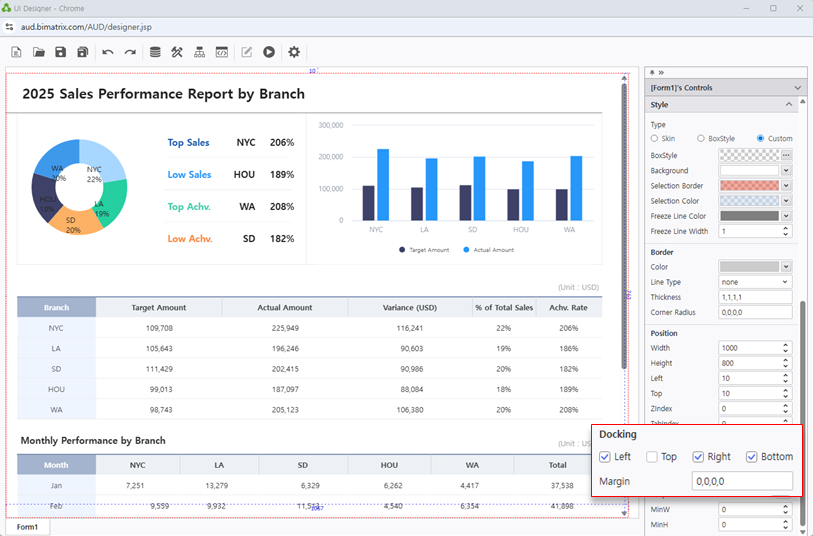
Drag & drop Excel file and configure docking
Open i-AUD Designer and drag & drop your prepared Excel file into the workspace.
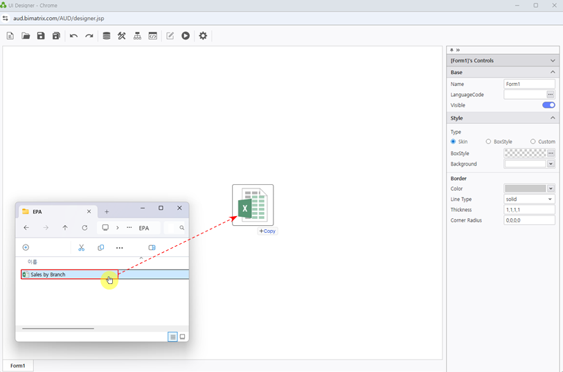
Configure the Docking settings to ensure the report layout fills the workspace correctly.
Configure Search Filter
Add Year label, calendar, refresh button, and chart colors
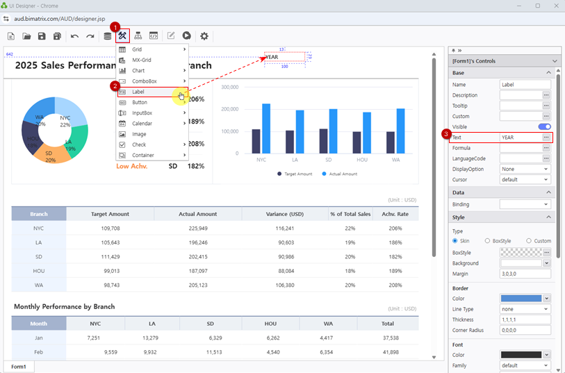
Place a Year label to identify the filter area on the report.
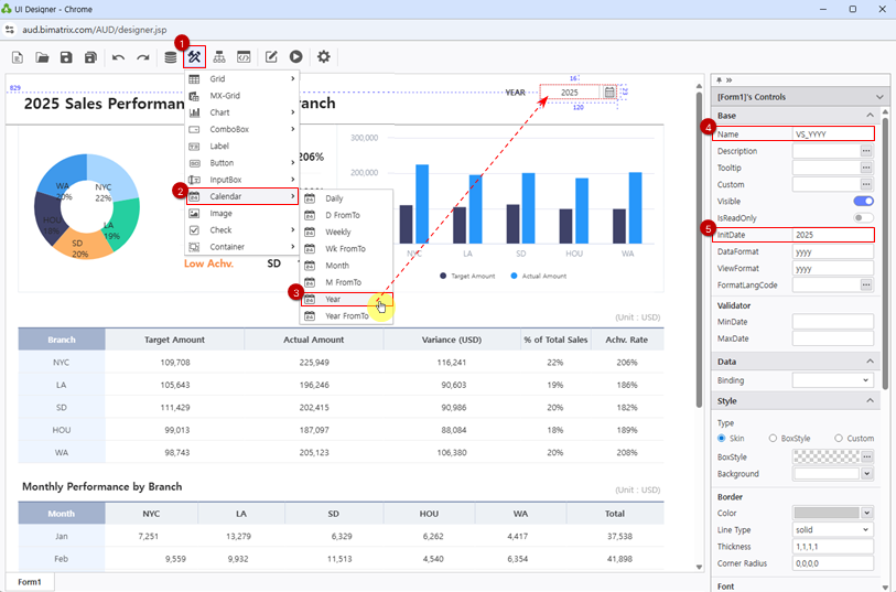
Add a Calendar picker linked to the VS_YYYY variable for year selection.
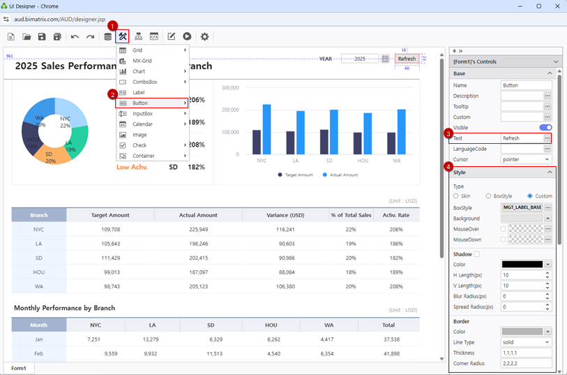
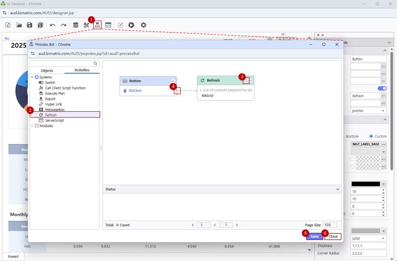
Add a Refresh button so users can reload the data after selecting a new year.
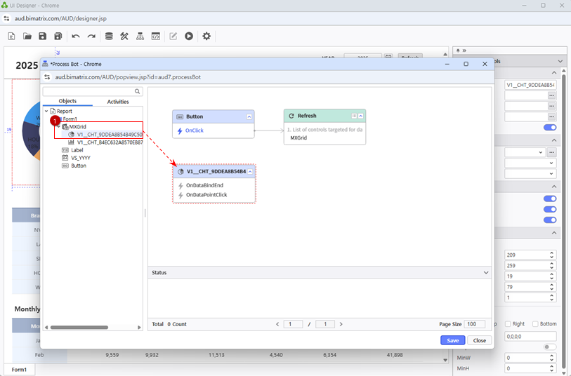
Review the Process Bot objects list to see all available components in the designer.
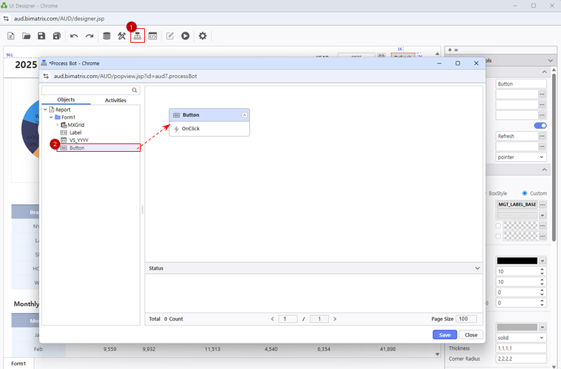
Connect the button to the Refresh module with the MXGrid component to enable data reload.
Connect the Color module for chart styling configuration.
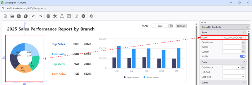
Select the chart object from the objects list to customize its appearance.
Apply a custom color palette to differentiate between target and actual sales amounts in the chart.
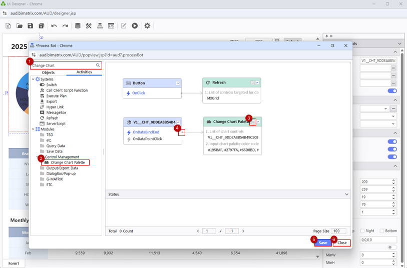
Tip: Using distinct colors for target vs. actual amounts makes it easy to spot branches that are over- or under-performing at a glance.
Save Your Report
Save to My Folder and verify the report
Save your completed report to My Folder.
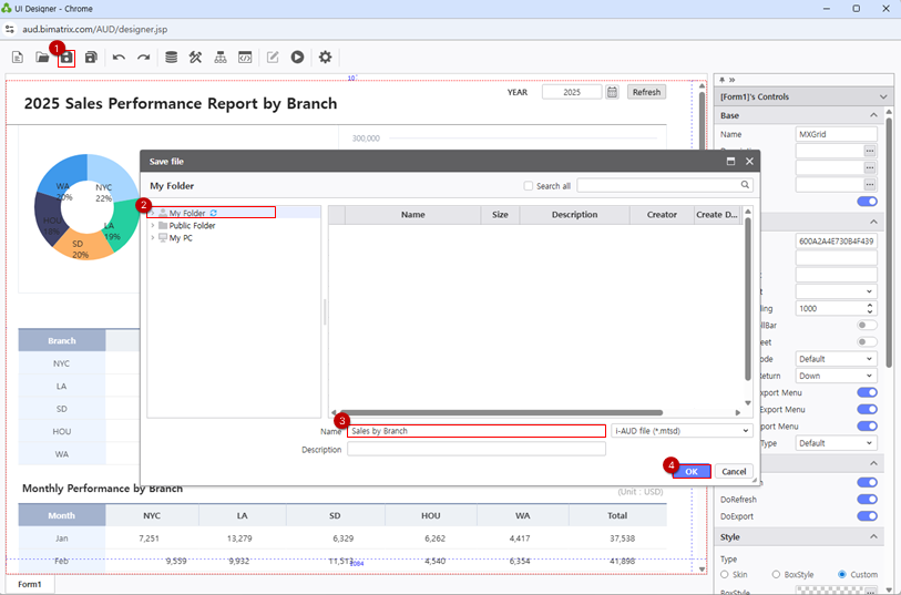
Verify the report displays correctly, the year filter works as expected, and the charts accurately visualize target vs. actual sales data.